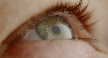
Shot composition is one of the most important aspects of filmmaking. What the audience sees on screen is the direct result of compositional choices that the filmmakers make. Great shot composition influences emotion, establishes character, and, most importantly, engages the viewer.
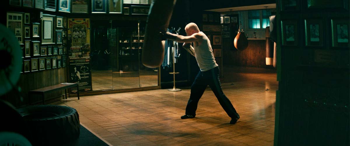
We’ll take a look at how shot composition works and how you can compose great shots of your own. While filmmaking and cinematography are creative endeavors, there are established composition techniques and rules you can follow. In this article, you will learn not only some of these rules but also why it’s good to break them sometimes.
Table of Contents
The Visual Toolkit for Shot Composition
Despite the incorporation of multiple art forms such as theater, literature, and music, a film’s visuals are the core of the cinematic experience. A well-established concept to advance a film’s narrative is visual storytelling: Instead of verbally explaining the story through dialogue or voice-over, it’s preferable to convey it visually. Carefully composed and edited shots allow filmmakers to tell their stories purely via the image.
Human perception works such that an image’s brightest and sharpest visual elements attract the eye first; naturally, these elements have a high visual weight in your composition. Colors work similarly: Vibrant colors will draw more attention than subdued colors.
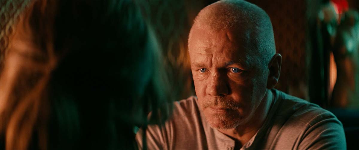
Where did you look first? Most likely at his face as it is in focus and comparatively bright
Balance
At its core, composition is about guiding the viewer’s attention by visually balancing the elements of your shot. Usually, the goal of shot composition is to create a well-balanced image, but visual imbalance can be a great way to add dynamic or amplify drama. Note that balance does not equal symmetry.
While symmetrical compositions usually create balanced images, symmetry is not necessary to create visual balance. Balance is about where the elements in your shot are positioned and how they relate to each other in terms of visual weight. This might sound complicated, but it will become clearer throughout the article.
Symmetric & Asymmetric Composition
Symmetry is the similarity between two halves of an image. To achieve symmetry, frame your shot such that it almost looks mirrored along one axis. Psychologically, humans value symmetry, as it brings order to chaos. Symmetrical compositions can feel more static than asymmetrical compositions, which will make your shot more dynamic. Asymmetry can give your shot a sort of spatial direction, which is great for amplifying movement or tension. We’ll go over this a bit more when we talk about leading room.
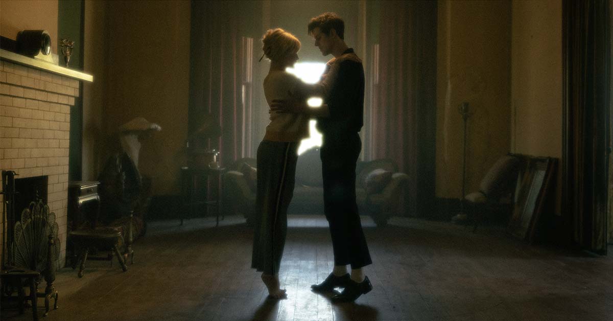
Symmetric Composition
When talking about symmetry, we need to briefly look at director Wes Anderson: He is arguably the best-known filmmaker in modern cinema using symmetry along with very distinct color schemes. He typically creates a “doll-house” theatrical aesthetic and his style is a great example of how symmetrically arranged shots can aid in storytelling and humor.
Depth & Leading Lines
Depth refers to the spatial distance between the camera and the end of the physical space. Good shot composition and lighting will help the audience perceive a three-dimensional world when they’re looking at a two-dimensional screen. The positioning of mise-en-scene and actors within the frame, along with lighting, is crucial to creating depth in your images.
Leading lines are the lines that subconsciously guide the viewers to your subject within the frame. These lines are often created by physical objects like architecture or terrain. Apart from guiding the viewer’s attention, leading lines can be used to create depth.
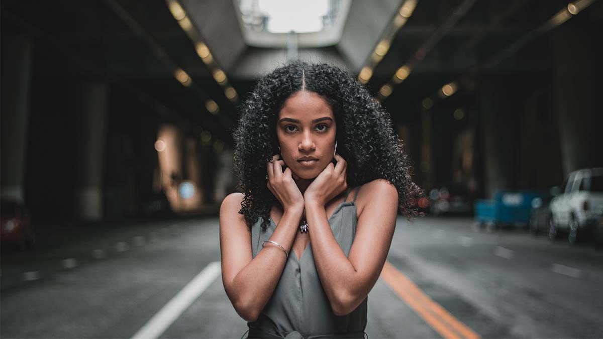
Leading Lines: Road marking and lights draw the viewer’s eyes to her face.
Lens Choice
Focal length will affect the field of view and, thus, the space that your shot will capture. It will also influence the perception of depth in your shots: Telephoto lenses reduce the perceived distance between your subject, the background, and the foreground. By contrast, wide-angle lenses can exaggerate the distance between your shot’s elements.

Wide-angle lens (left) vs. telephoto lens (right): Note that the background appears closer with the telephoto lens.
Lens choice also influences depth of field (DOF), which refers to the separation between the nearest and farthest objects in a region that is in acceptably sharp focus. To guide the audience’s attention, deliberately make use of deep focus or shallow focus when composing your shots.
Plan your composition
You can use Cadrage’s director’s viewfinder app to plan and pre-visualize your shots on your iPhone or iPad. Cadrage will provide you with accurate framing previews for any camera and lens combination and will make choosing the right lens much easier.
Shot Composition Techniques
While cinematography is an art form, certain shot composition rules in the cinematic language have been proven to engage audiences and create aesthetically pleasing visuals. Knowing these fundamentals will help you quickly improve your shot compositions. After you learn the basics, experiment with how you can creatively break these compositional rules.
The Rule of Thirds
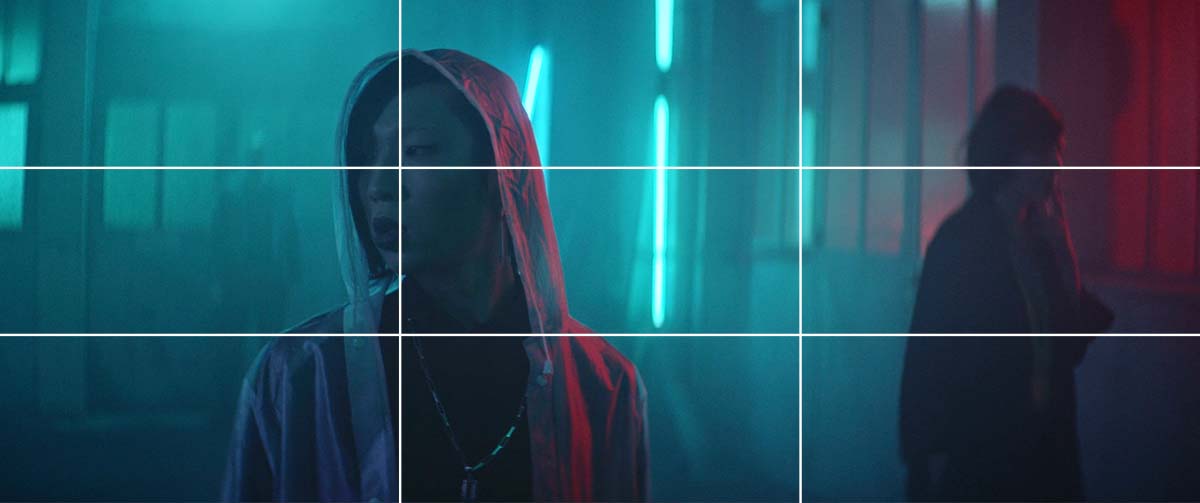
The rule of thirds is a compositional guideline in which the frame of an image is divided into thirds. Placing your main subject on one of these lines, with the main point of interest at one of the intersections, can help you compose an aesthetically pleasing image.
In general, this will make your shot look more dynamic compared to positioning your subject centrally. The rule of thirds will help you establish a visual hierarchy in your shot and keep the viewer’s eyes engaged across the whole frame.
Rule of Thirds
Notice how the shot is balanced: The first two-thirds of the image contains the brightest and sharpest elements, so the eyes are immediately drawn to this area. The right third of the image is comparatively dark and creates contrast through color. Also, the extra standing in the background adds just a bit of visual weight so that the shot ends up being asymmetrically balanced.
Head Room
Head room is the space between the top of the frame and your subject. It operates completely on the vertical plane. The appropriate head room depends highly on shot size, but also on the camera operator’s preferences. A good rule of thumb is to place the subject’s eyes roughly on the line of the top third (see the rule of thirds), which will often make the head room fall into place nicely. Close-ups give you much more leeway in terms of head room and will also allow you to crop some of your subject’s head.
Playing with head room in your composition is also a great way to intentionally create imbalance in your shots. Try using very little or a lot of head room and see the effect it has on your overall image.
The cinematography of Mr. Robot is a great example of how framing for increased headroom can be used artistically:
Leading Room
Leading room refers to the space in front of your subject. Framing your subject in a way that leaves more space in the direction of their movement or gaze usually feels harmonious. In a way, it allows the audience to “look ahead” in the same direction as your subject. Using very little leading room and having your subject face the edge of the frame, creating lots of space behind them, can evoke a sense of unease. As with head room, make this a deliberate artistic choice.
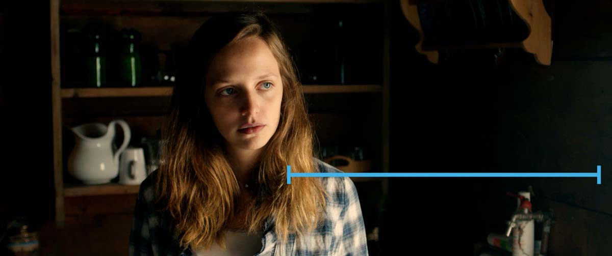
Regular leading room
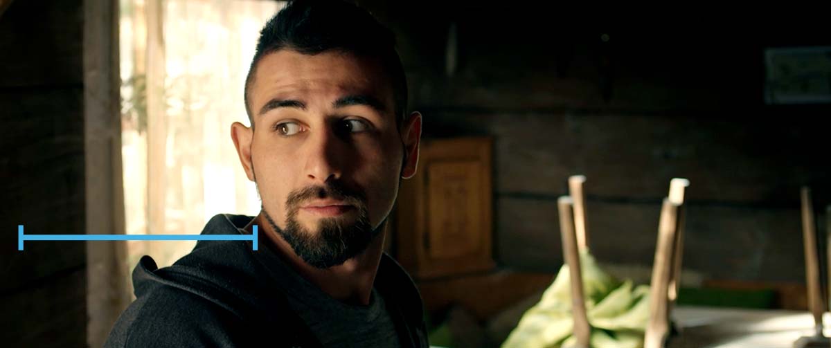
Reduced leading room
Conclusion
While there is much more to explore in terms of shot composition and framing (for example, the influence of different aspect ratios or how camera movement can dynamically change composition during the shot), we will conclude this article here.
You have learned the basics of shot composition, so now it’s time to utilize your creativity and show how these methods can work for you. As mentioned before, filmmaking is an art, so don’t restrict yourself to these guidelines – some of the best films break compositional rules.
FAQ
How can I improve my shot composition?
Practice. You can watch all the tutorials and read all the theory books you like, but you will improve your composition only through experience. This guide provides a kickstart; now it’s time to take what you’ve learnt and experiment!
What are common shot sizes?
These are common film shot sizes and their abbreviations:
- Extreme Close-Up (ECU)
- Close-Up (CU)
- Medium Close-Up (MCU)
- Medium Shot (MS)
- Medium Wide Shot (MWS)
- Wide Shot (WS)
- Extreme Wide Shot (EWS)
What is mise-en-scene?
Mise-en-scene is the arrangement of props and actors within a film’s visual space. Every physical property you see on the screen is mise-en-scene. Shot composition is the positioning of the camera in relation to the mise-en-scene. These two aspects of filmmaking are not mutually exclusive. Great films use mise-en-scene to inform the shot composition and vice versa.


